Design comparison
Solution retrospective
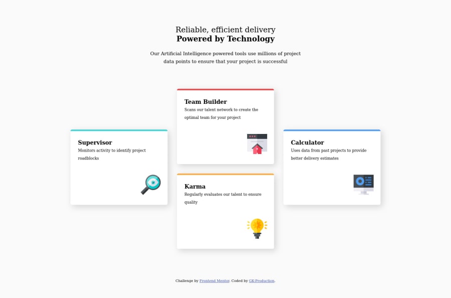
This is a mobile-first layout and for the desktop layout I used Grid Layout for the cards. Again your feedback is highly appreciated and it will help me to improve for my future challenge here.
Community feedback
- @said-alrovePosted over 3 years ago
Hi! well done dude, just a few things:
✅.- You didn't import the font to the project, therefore it's using a default one, you can do two things here, import the font from your HTML, or from your CSS, the problem with the second option is that you can have a little bit of delay when loading the font due to the browser first renders the HTML (the content) and then renders the styles, thus you can have a weird moment when everything is done except your fonts, so it's your desition to choose from where to import your font. Here you have the font.
✅.- You declared the box-sizing property in your universal selector only, remember that you should declare it in both, your universal selector (with the pseudo-elements "before" and "after") and your "html" tag. For more information check this out.
✅.- I highly recommend you to order your CSS code in the following way: Globals (all your html tags, no classes here), utilities (here are classes that are shared by more than one element to assign it one or more properties, here your main container could stay), and then your normal styles (I separate this section by main components, in this case, you could put your Grid container altogether with the cards container, then your cards individually, and at the end your attribution). By the way, the way how I separate them is by commenting something descriptive like "MAIN-CONTAINER" at the beginning of the section.
✅.- You created two main containers, the first one is "grid-card-container", and the second one is "card", one of them is unnecessary, whichever you conserve, you can assign it all the styles there and everything will work perfectly (I'd assign to that container the "cards-container" class name" as a recommendation).
✅.- You used "translate" to position the side cards in the middle of the ones that are located in the half, as a recommendation ... I'd create a Grid with 4 rows, that way you can position the side cards from row 2 to row 4, and the ones that are located in the middle might be positioned from row 1 to row 3, and so on. Thanks to that you can have more control over your layout due to "translate" is something relative that could be not consistent.
✅.- Same as up, you can create a "middle design" to make it look better in the tablet view, you can check, as Patrick mentioned to you, my solution to this challenge, I basically inverted the design in the tablet view by creating a 3:4 Grid instead of a 4:3 as in the desktop view.
I hope this could be useful for you :D, have a nice day!.
Marked as helpful0@GK-ProductionPosted over 3 years ago@said-alrove Thank you so much for your feedback and a very nice recommendations, this will help me a lot. Have a nice day and stay safe.
0 - @palgrammingPosted over 3 years ago
You need to look at your transition point between your desktop and mobile layout. Depending on screen width at some point in mid screen widths your calculator card is exiting the side of the browser
This person just uploaded their results to this challenge a little bit ago and their transition is really good for all screen sizes maybe looking at it will help you https://www.frontendmentor.io/solutions/fourcard-feature-with-a-cool-animation-sasssmacss-xYLyDShvs
Marked as helpful0@GK-ProductionPosted over 3 years ago@palgramming yeah I've check it and thank you so much.
0
Please log in to post a comment
Log in with GitHubJoin our Discord community
Join thousands of Frontend Mentor community members taking the challenges, sharing resources, helping each other, and chatting about all things front-end!
Join our Discord