Design comparison
SolutionDesign
Solution retrospective
Four Card Feature Section Challange
Community feedback
- @timidx3Posted over 4 years ago
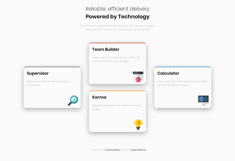
As someone else noted, color on the left card is off. The text colors aswell are off, being much darker than the original. Make sure to check your style guide again.
0 - @gomezlucasPosted over 4 years ago
Nice work Mata! there is just one issue with the colour border of the left card.
0
Please log in to post a comment
Log in with GitHubJoin our Discord community
Join thousands of Frontend Mentor community members taking the challenges, sharing resources, helping each other, and chatting about all things front-end!
Join our Discord
