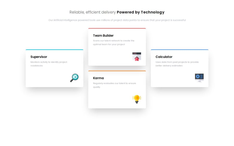
Design comparison
SolutionDesign
Solution retrospective
What are you most proud of, and what would you do differently next time?
Use grid and flexbox to control the layout
What challenges did you encounter, and how did you overcome them?learn to pass down css as prop to control the design
What specific areas of your project would you like help with?css grid
Community feedback
- @nickabatePosted 10 months ago
Make sure close attention is paid to the colours of the original design. You'll find that your feature card headers are coloured black while the design is slightly different.
0
Please log in to post a comment
Log in with GitHubJoin our Discord community
Join thousands of Frontend Mentor community members taking the challenges, sharing resources, helping each other, and chatting about all things front-end!
Join our Discord
