Design comparison
Solution retrospective
Very open to suggestions
Please log in to post a comment
Log in with GitHubCommunity feedback
- P@Anjie-MF
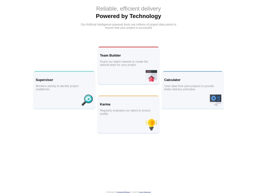
Hello! HTML---The HTML structure is clear and semantic. So, good job there! Accessibility--- I would add 'aria-labels' to the images for better accessibility. I just learned the difference between aria labels and alt text. "alt": Use alt for images to describe the content . "aria-label": Use aria-label for any interactive element Layout---When viewed on different screen sizes, the layout becomes wonky, and elements do not resize properly. I would review and adjust the media queries. Also, use a CSS validator to catch any typos or open tags. Then, test thoroughly using Chrome DevTools' device simulation feature or https://responsivetesttool.com/ (I bookmarked this site). Solution---The design comp has a box shadow on the cards. Yours is not visible enough. I made mine grayer so it contrasts against the stark white background.
P.S. There is a tiny typo on line 40 which may help with the layout. P.P.S I would add a CSS reset to your file. It removes potential inconsistencies between different browsers. I highly recommend Andy Bell CSS Reset. With a few minor adjustments, this project could be even more polished. Keep up the great work and continue building on these skills!
Join our Discord community
Join thousands of Frontend Mentor community members taking the challenges, sharing resources, helping each other, and chatting about all things front-end!
Join our Discord
