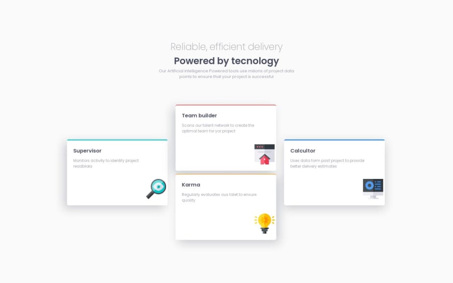
Design comparison
Solution retrospective
Please feel free to provide any feedback or suggestions on how I can improve. Your comments are greatly appreciated.
Community feedback
- @muhammad-medhatPosted over 1 year ago
Hi, Great job Mohamed, but you didnt make designs for all screens. Try creating your designs with a mobile first approach. In which you first design all the layouts for the smallest device(mobile) and using @media you can modify the look for bigger devices step by step.
0 - @JeuriMorelPosted over 1 year ago
Great job Mohamed. Looks like you forgot to check what the site looks like on mid-sized screens. It looks great on both mobile and full screen, but the layout breaks between the widths 650px and 980px.
0
Please log in to post a comment
Log in with GitHubJoin our Discord community
Join thousands of Frontend Mentor community members taking the challenges, sharing resources, helping each other, and chatting about all things front-end!
Join our Discord
