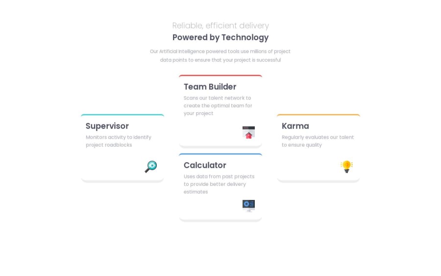
Design comparison
SolutionDesign
Solution retrospective
What did you find difficult while building the project?
- The shadow at the bottom of the panel. I'm unsure if that's just a border-bottom or a complete box-shadow. Other than that, I'm completely happy with my result. It's completely responsive to iPad screens and desktop large screens
Community feedback
- @nelsonbernardPosted over 1 year ago
Congratulations on finishing the challenge! In response to your question, it is indeed a box-shadow and very easy to implement. In case you're unfamiliar, here's a good article on box shadows in css.
You can just add it to your panel class. Most shadows just use black for the color and adjust the transparency using an rgba value like so:
.panel{ box-shadow: 0px 10px 10px rgba(0, 0, 0, 0.5); }box-shadow: [horizontal offset] [vertical offset] [blur radius] [color];
Hope that helps!
0
Please log in to post a comment
Log in with GitHubJoin our Discord community
Join thousands of Frontend Mentor community members taking the challenges, sharing resources, helping each other, and chatting about all things front-end!
Join our Discord
