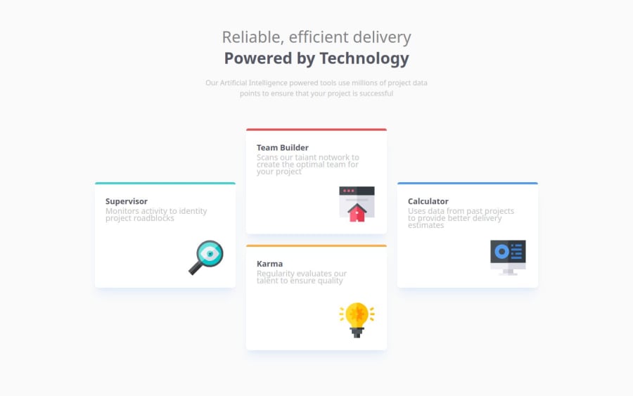
Design comparison
SolutionDesign
Solution retrospective
What are you most proud of, and what would you do differently next time?
What I liked most was the process above all, the time I spent thinking about the layout in the shape of a cross, I forced myself to use tailwind and as I went along I had the impression I was learning new things and making progress.
I might have liked to find out more easily with css grid how to do the layout, but I didn't succeed and so I fell back on flexbowx, which I master better
What challenges did you encounter, and how did you overcome them?It was mainly a question of doing the layout and being as close as possible to pixel perfect.
What specific areas of your project would you like help with?I would have liked to know how others would have done using css grid instead of flex box.
Community feedback
Please log in to post a comment
Log in with GitHubJoin our Discord community
Join thousands of Frontend Mentor community members taking the challenges, sharing resources, helping each other, and chatting about all things front-end!
Join our Discord
