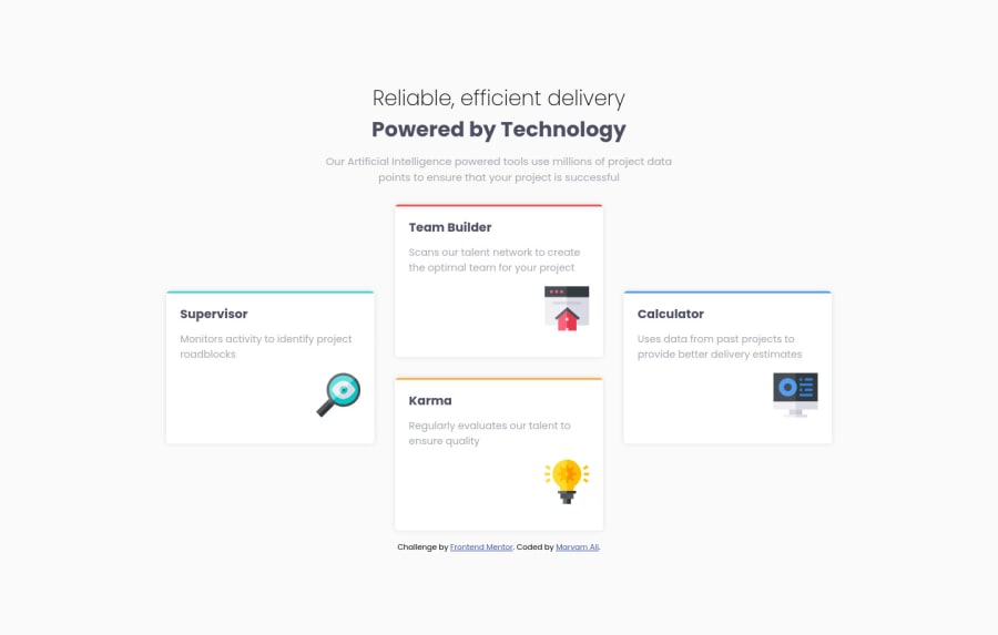
Design comparison
Community feedback
- @VCaramesPosted about 2 years ago
Hey there! 👋 Here are some suggestions to help improve your code:
-
The “Reliable, efficient delivery Powered by Technology” should be inside a
headerelement and be placed outside themainelement, to improve semantics. -
The “Reliable, efficient delivery Powered by Technology” is one single heading so the entire thing should be wrapped in a single <h1> Heading along with a Span Element.
-
The icons serve no other purpose than to be decorative; They add no value. There Alt Tag should left blank and have an aria-hidden=“true” to hides it from assistive technology.
-
Using CSS Grid with Grid-Template-Areas will make things way easier when building the layout; it will give you full control of the layout.
Here is an example of how it works: EXAMPLE
If you have any questions or need further clarification, feel free to reach out to me.
Happy Coding! 🍂🦃
Marked as helpful0@MaryamhusseinPosted about 2 years ago@vcarames thank u valuable comment for the Grid-Template-Areas I avoid to use it because it is so easy and I think it will not helping me to improve design skills
0@VCaramesPosted about 2 years ago@Maryamhussein
"Grid-Template-Areas I avoid to use it because it is so easy and I think it will not helping me to improve design skills"....This made my day! I love it!
I love meeting people that are not afraid to challenge themselves!
Keep it up!
0 -
Please log in to post a comment
Log in with GitHubJoin our Discord community
Join thousands of Frontend Mentor community members taking the challenges, sharing resources, helping each other, and chatting about all things front-end!
Join our Discord
