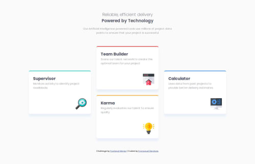
Submitted over 1 year agoA solution to the Four card feature section challenge
four-card-feature-section
@DAEM007

Solution retrospective
What are you most proud of, and what would you do differently next time?
- I am happy I had to work with vanilla css to create the responsive design of this feature.
- The little challenge was just trying to make the cards look good on most screens. I had to employ flexbox along with little media queries.
- I am opened to ideas on how I can improve the implementation of my solution.
Code
Loading...
Please log in to post a comment
Log in with GitHubCommunity feedback
No feedback yet. Be the first to give feedback on EMMANUEL DAMILOLA's solution.
Join our Discord community
Join thousands of Frontend Mentor community members taking the challenges, sharing resources, helping each other, and chatting about all things front-end!
Join our Discord