Design comparison
Solution retrospective
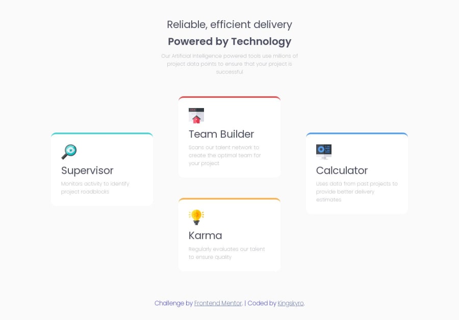
This was a very good project, I really enjoyed solving it 🙂. All suggestions are welcome 👋.
Community feedback
- @MelvinAguilarPosted about 1 year ago
Hello there 👋. Good job on completing the challenge !
I have some suggestions about your code that might interest you.
CSS 🎨:
-
The paragraph with the class
.intro-pshould not have a fixed width ofwidth: 30rem;because on mobile devices, your project doesn't adapt well. This element cannot be resized, and it even generates a horizontal scrollbar.The solution would be to use
max-widthinstead of a fixedwidthto ensure better responsiveness.
HTML 🏷️:
- You should use only one
<h1>tag per page. The<h1>tag is the most important heading tag, This can confuse screen reader users and search engines. You can read more about this here 📘.
I hope you find it useful! 😄 Above all, the solution you submitted is great!
Happy coding!
Marked as helpful1@KingSkyrosPosted about 1 year ago@MelvinAguilar thanks for the help i have updated my code. 🙋♂️
0 -
Please log in to post a comment
Log in with GitHubJoin our Discord community
Join thousands of Frontend Mentor community members taking the challenges, sharing resources, helping each other, and chatting about all things front-end!
Join our Discord
