Design comparison
Community feedback
- @efabrizio75Posted 7 months ago
Congratulations on completing this challenge.
You used semantic HTML. It is accessible even though I would not skip heading levels and use
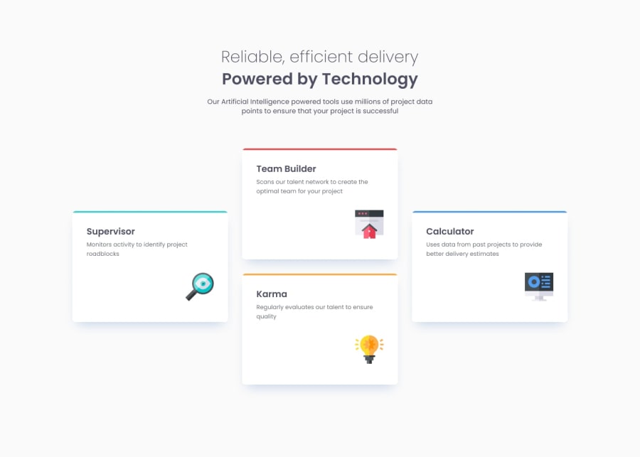
h2for the cards' titles. I liked the structure of your code and the usage offloat: rightto position to the icons, cool idea.The only issue I found is with the screen widths between 700px and 1200px: the translationY value causes two of the feature cards to be staggered incorrectly.
Marked as helpful1 - P@francimelinkPosted 7 months ago
Hi Eric,
I review your solution. Sady I couldnt get to the code.
Semantic HTML: The solution does utilize semantic HTML, but some areas could benefit from additional tags like <article> or <section> for better structure.
Accessibility: While accessible with appropriate text contrast and alt attributes, it violates the rule of having a single <h1> on the page. A solution would be splitting the content within <h1> into <span> elements for emphasis without using multiple <h1> tags.
Responsiveness: The layout adapts well across various screen sizes, maintaining a clean structure.
Code Quality: The code appears well-structured, though could be enhanced with reusable CSS classes and clearer comments.
Design Accuracy: The implementation is fairly close to the original design with minor visual differences.
Great work overall! Best of luck with future challenges.
Franci
Marked as helpful0@EAguayodevPosted 7 months ago@francimelink I just realized I had the repo private, which is why you couldn't view the code.Thanks for the feedback on the H1 violation; I just fixed it.
1
Please log in to post a comment
Log in with GitHubJoin our Discord community
Join thousands of Frontend Mentor community members taking the challenges, sharing resources, helping each other, and chatting about all things front-end!
Join our Discord
