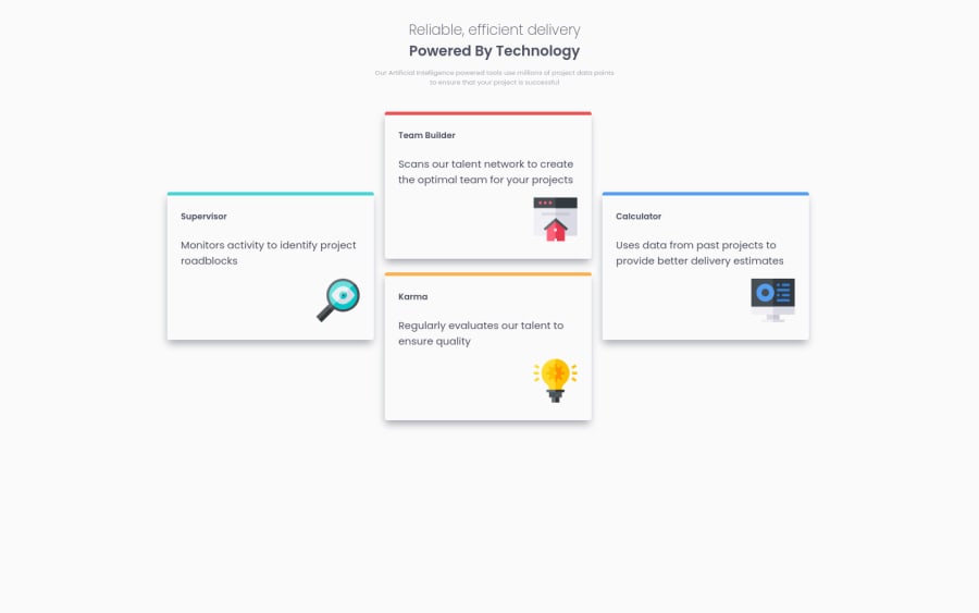
Four-Card-Feature Solution using CSS Grid
Design comparison
Solution retrospective
Hello, hope your doing well ? Please i'll like for you to review my project and give me useful tips on areas you feel i need to improve. Thanks a lot! for sharing your time with me.
Community feedback
- Account deleted
Hey there! 👋 Here are some suggestions to help improve your code:
-
Remove the
max-width: 1440px;from the Body Element (never add awidth/max-widthto the body element) and add amin-height: 100vh;. -
The “Reliable, efficient delivery Powered by Technology” is one single heading so the entire thing should be wrapped in a single <h1> Heading along with a Span Element.
-
Change the
Articleto aSectionto wrap all the card components. -
Using CSS Grid with Grid-Template-Areas will make things way easier when building the layout; it will give you full control of the layout.
Here is an example of how it works: EXAMPLE
-
The icons serve no other purpose than to be decorative; They add no value. There Alt Tag should left blank and have an aria-hidden=“true” to hides it from assistive technology.
-
Your content is not fully responsive. Here is a link to Google Developer’s site that will teach you how make it 100% responsive:
If you have any questions or need further clarification, let me know.
Happy Coding! 👻🎃
1 -
- @ikennarichardPosted over 2 years ago
Thanks a lot @vcarames, i'll take time to look into all you said so i can understand them very well. I appreciate the effort you took going through the code and pointing out these solutions. Thanks for helping me !
0
Please log in to post a comment
Log in with GitHubJoin our Discord community
Join thousands of Frontend Mentor community members taking the challenges, sharing resources, helping each other, and chatting about all things front-end!
Join our Discord
