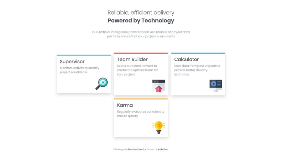
Four-card-feature section (with HTML, CSS, and Bootstrap)
Design comparison
Solution retrospective
I used quite a lot of Bootstrap classes and wrote a bunch of custom CSS as well. I feel like I didn't explore the possibilities of Bootstrap enough, especially when I had to explicitly set some (static) div's top-positions to have the correct positioning. How should I have done this better?
Community feedback
- @argelomnesPosted almost 5 years ago
Hi Solomon!
I'm currently looking into frameworks myself and my thought is to really get familiar with it. In your case, how Bootstrap does things which I think you already do. To make this better I suggest removing the
top: 0;from your divs on large breakpoint. This will perfectly align the left and right cards vertically. Nice work!0@krebeDevPosted almost 5 years ago@argelomnes Thanks for the feedback. I've fixed it.
0
Please log in to post a comment
Log in with GitHubJoin our Discord community
Join thousands of Frontend Mentor community members taking the challenges, sharing resources, helping each other, and chatting about all things front-end!
Join our Discord
