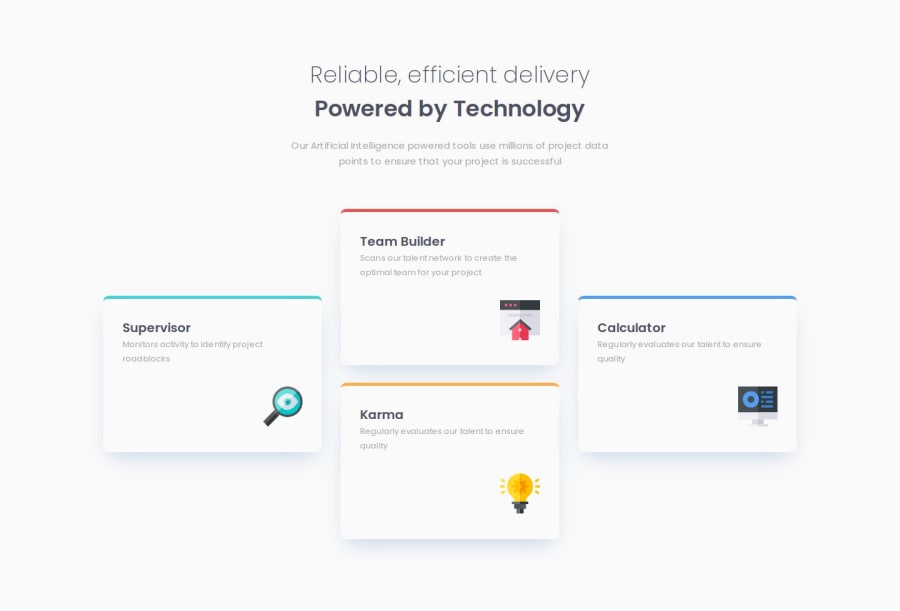
Four_card_feature - responsive until 200px
Design comparison
Solution retrospective
- Here i have to think how to prepare HTML for breakpoint switching.
- Playing with flexbox. That was fun. I tryed some things to do without flex box and i made tons of code and the just one parrametr in flex box and it works as well. One line of code. Nice.
Thinking ahead. Write some notes before started.It takes time but in the end it is shorter if you stick with the plan.
What specific areas of your project would you like help with?Still BEM naming. Id like to usem better in the SASS with & parrent selector. Still strugelling with naming classes in HTML. Parrent of parrent makes me trouble.
Community feedback
- @olivervillalobosPosted 10 months ago
I would suggest to read an article about when to use sections and articles, the cards are components that you could place anywhere on a given website, so using articles is not the best choice (This is my opinion), I liked the approach you used of dividing it in three sections (left,center,right).
Great Job!
Marked as helpful0
Please log in to post a comment
Log in with GitHubJoin our Discord community
Join thousands of Frontend Mentor community members taking the challenges, sharing resources, helping each other, and chatting about all things front-end!
Join our Discord
