Design comparison
SolutionDesign
Solution retrospective
What are you most proud of, and what would you do differently next time?
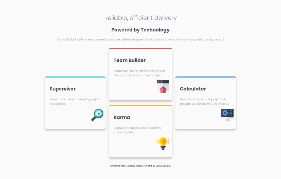
Hi friends, with this challenge I was practicing Flexbox. I wish you all the best.
Community feedback
- @MuliroMattPosted 11 months ago
Hi Sanja, your page looks really good! You did a great job. I just wanted to mention that although you solved this project using flex, using grid would actually be the better option. It's generally easier to work with than flex in cases like this.
0
Please log in to post a comment
Log in with GitHubJoin our Discord community
Join thousands of Frontend Mentor community members taking the challenges, sharing resources, helping each other, and chatting about all things front-end!
Join our Discord
