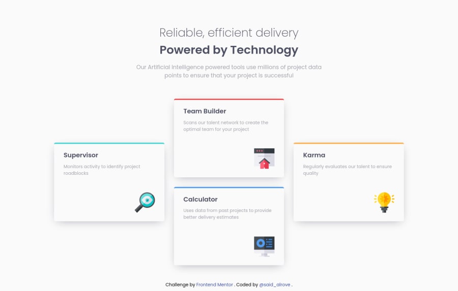
Four-card feature with a cool animation (SASS/SMACSS)
Design comparison
Solution retrospective
Hi, what's up? Something I'd like to mention is that I made two designs with Grid, one focused on tablet and the other one on desktop due to that way everything looks better (If I had waited until the desktop view for the Grid container everything would've looked weird in the tablet view).
The first design (for tablets) is a 4-column and 3-row Grid, and the second one (for desktops) is a 3-column and 4-row Grid.
Just as the last thing, I used the SMACSS methodology once again, and also my own library for SASS mixins to give me a hand with things like Media Queries, Flexbox, and Grid (I recently added a new feature related with the media queries, therefore this is the first time that I use it).
As always, feedback is appreciated :D!.
Community feedback
Please log in to post a comment
Log in with GitHubJoin our Discord community
Join thousands of Frontend Mentor community members taking the challenges, sharing resources, helping each other, and chatting about all things front-end!
Join our Discord
