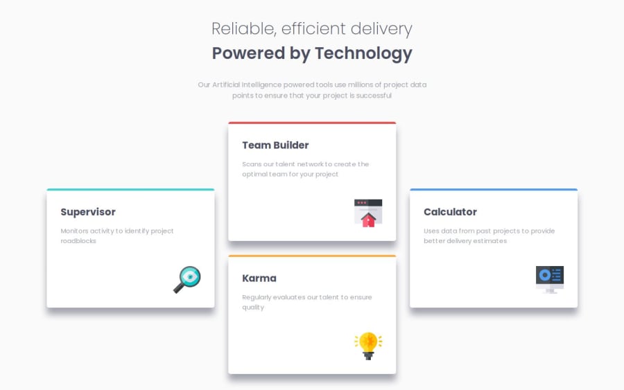
Design comparison
SolutionDesign
Solution retrospective
What are you most proud of, and what would you do differently next time?
Being able to use both grid and flex without much difficulty.
What challenges did you encounter, and how did you overcome them?- How to center each card in each grid
- How to make the image appear in the bottom-right corner of each card
I used flex inside the cards and add align-self: self-end to the images and align-self: center to each column
What specific areas of your project would you like help with?I would like to make the shadows lighter without changing the specified color, and how to add animations such as cards moving or font shrinking/zooming up when resizing the window.
Community feedback
Please log in to post a comment
Log in with GitHubJoin our Discord community
Join thousands of Frontend Mentor community members taking the challenges, sharing resources, helping each other, and chatting about all things front-end!
Join our Discord
