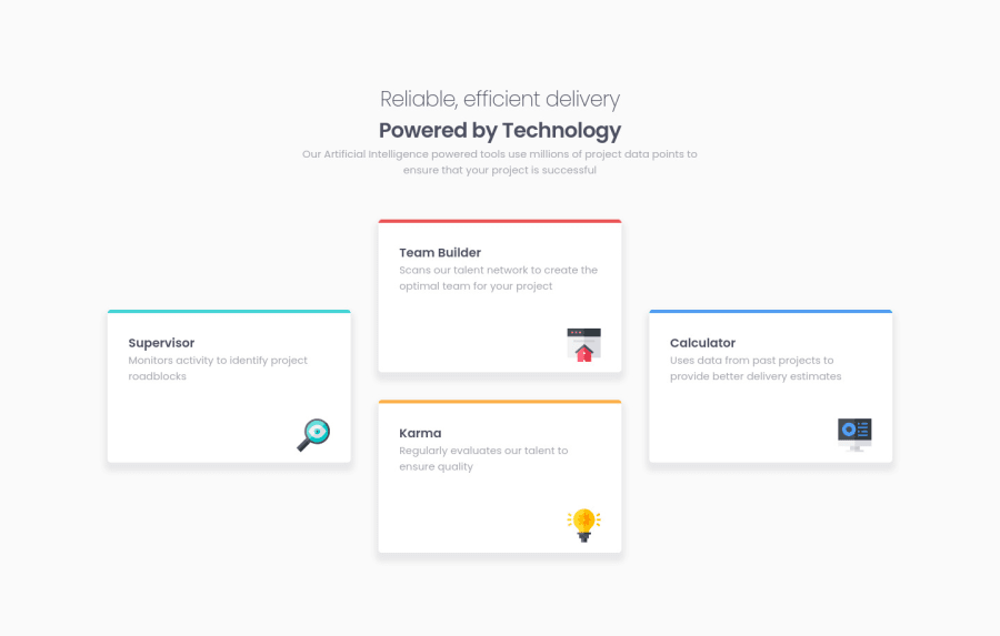
Design comparison
Solution retrospective
hey guys, I just finished this task. Just started learning how to make my code responsive. I would appreciate your feedback and make corrections, thank you!😎😎
Community feedback
- @VCaramesPosted about 2 years ago
Hey @Ljr777, some suggestions to improve you code:
-
The .heading-box should wrapped in a Header Element.
-
The icons serve no other purpose than to be decorative; They add no value. There Alt Tag should left blank and have an aria-hidden=“true” to hides it from assistive technology.
-
Reduce the
paddingfrom your Body Element; you should never use that much. -
Your icons are overflowing when your screen shrinks. You either want to add a third layout to help keep them in place.
Happy Coding! 👻🎃
Marked as helpful0@Ljr777Posted about 2 years agohey @vcarames , how are you? thanks for the corrections I have made worked on them, but for the last one I dont know why my icons keep going out of the articles. Its happening at different screen sizes for me. can you please suggest to me a better way to position each icon inside each article. thank you so much for the feedback:D:D:D!!!
0@VCaramesPosted about 2 years ago@Ljr777
You can give the icons a Position: Absolute and place them in the correct place.
Here is how I did mine:
0@Ljr777Posted about 2 years ago@vcarames ok thanks a lot, will study it and make corrections
0 -
Please log in to post a comment
Log in with GitHubJoin our Discord community
Join thousands of Frontend Mentor community members taking the challenges, sharing resources, helping each other, and chatting about all things front-end!
Join our Discord
