

Design comparison

Community feedback
- P@jayco01Posted about 2 months ago
Hey Arman! Great job on your Four Card Feature Section! Your layout is well-structured, and the use of CSS Grid makes the cards align nicely. The responsiveness is also well-implemented, especially with your media queries.
Suggestions for Improvement:
-
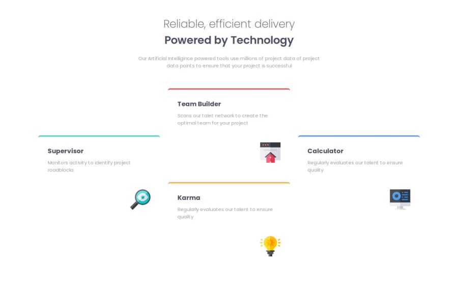
Class Naming Could Be More Descriptive Currently, classes like .box, .box1, .box2, etc., are too generic and don't describe their purpose well. Consider using more meaningful names like .card--supervisor, .card--team-builder, etc. This improves readability and makes the CSS easier to maintain.
-
Add Shadows for Better Visibility Since both the body background and the cards are white, the cards blend into the background. Adding a subtle shadow will help them stand out. A light box-shadow effect will create better contrast and improve readability.
Overall, your solution is Amazing!
0P@armanijacobsPosted about 2 months ago@jayco01 Hello Jayco,
Many thanks for you response. Having descriptive names is a change that I will work on implementing. As for the shadows your'e completely right! Guess I rushed to upload and totally forgot.
Thanks once again, all the best!
1 -

Please log in to post a comment
Log in with GitHubJoin our Discord community
Join thousands of Frontend Mentor community members taking the challenges, sharing resources, helping each other, and chatting about all things front-end!
Join our Discord