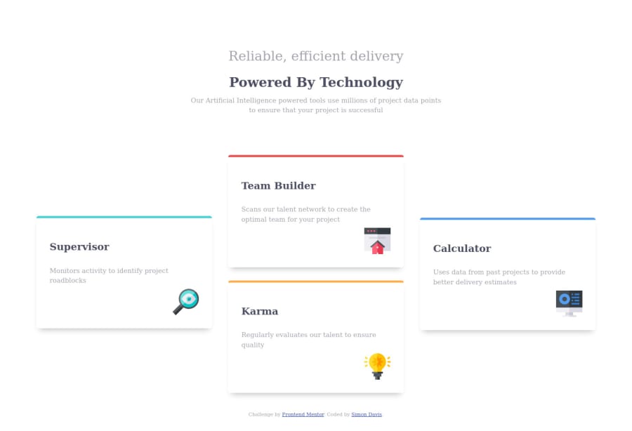
Design comparison
Solution retrospective
Any feedback is cool. I just wanted to speed run this design and time myself on how much I can accomplish in a short period so there might be a glaring mistake maybe.
Community feedback
- @pikapikamartPosted over 3 years ago
Hey, great work on this one. Though I had to zoom out to see the desktop view. Are you using large screen? Your
min-width: 1440for the desktop does not really suits other, like me who uses traditional 1366x768 dimension. The the desktop layout is good as well as the mobile view.Couple of little suggestions would be that:
-
Lowering down the breakpoint, since
min-width: 1440pxis too much, you could have made another desktop layout in a breakpoint lower than that. Only apply mobile view, where you think the layout is near enough a phone's ppi. -
The two text at the upper part could have been wrapped inside a single
h1since they are both suited for heading tag. Then just wrapped the second text in aspanto make it bold and have that black color.
Aside from that, really good job on this ^^
1@SkidragonPosted over 3 years ago@pikamart thanks for the feedback! For the desktop media query, I was just following the readme specs but as a developer I should question that lol. On the second point, I will keep that in mind. :)
0 -
- @palgrammingPosted over 3 years ago
it looks good but this design really needs a mid transition point were you have two columns of cards two rows tall so it has a better transition between mobile and desktop.
but you got all the elements and the layout of the given design accomplished really good in this challenge ⭐⭐⭐⭐⭐
1@SkidragonPosted over 3 years ago@palgramming cool, I'll look into the transition part, I just got an idea that popped into my head all of a sudden so thanks!
1
Please log in to post a comment
Log in with GitHubJoin our Discord community
Join thousands of Frontend Mentor community members taking the challenges, sharing resources, helping each other, and chatting about all things front-end!
Join our Discord
