Submitted about 1 year agoA solution to the Four card feature section challenge
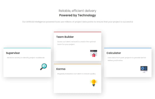
Four Cards using Flexbox and Grid
@oduwa-A

Solution retrospective
What are you most proud of, and what would you do differently next time?
Figuring out the Grid was surprisingly easy. Using the span element to help the boxes move throughout the grid was a very nice thing to know. I'd see if I could condense the amount of grid elements used next time.
What challenges did you encounter, and how did you overcome them?Understanding how to place the images was alittle tough. I overcame the problem by messing around with the position element and messing around with size.
What specific areas of your project would you like help with?I would like to know how to format text better, since I didn't exactly format it as presented.
Code
Loading...
Please log in to post a comment
Log in with GitHubCommunity feedback
No feedback yet. Be the first to give feedback on oduwa-A's solution.
Join our Discord community
Join thousands of Frontend Mentor community members taking the challenges, sharing resources, helping each other, and chatting about all things front-end!
Join our Discord