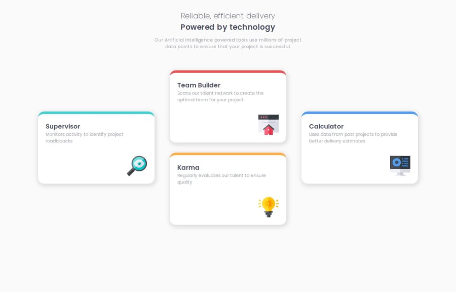
Design comparison
Solution retrospective
I got reacquainted with CSS Grid & used Sass for the very first time.
What challenges did you encounter, and how did you overcome them?I was not sure how to handle the cards' unusual placement, and I experimented with the number of columns/rows to include before setting for 3.
What specific areas of your project would you like help with?Is clamp() the ideal solution for setting the cards sizes, or should I go with something else?
Community feedback
- @Grimm-NPosted 12 days ago
First off, fantastic work! 🎉 Your code is clean and organized, and it’s great to see how much effort you’re putting into the details. It’s really coming together nicely! 👏
Just a few tips to keep in mind as you refine things further:
-
Simplify the @font-face Declarations: You can streamline your
@font-face
code by using a variable font setup, which makes it more concise and efficient. Here’s an example:@font-face { font-family: "Poppins"; src: url("../fonts/Poppins/Poppins-Variable.ttf") format("truetype"); font-style: normal; font-weight: 200 600; }
This way, you avoid repetition by only listing the font family and style once per weight variation. It’s a cleaner approach that can help reduce code bulk! 📝
-
Use Relative Units (em, rem, %, vw, vh) Instead of Pixels: Relative units like
em
,rem
,vw
, andvh
are super helpful for creating a more responsive design. Unlike pixels, which are fixed, relative units adapt more smoothly across different screen sizes and settings (including accessibility settings like larger text), making your design more flexible and user-friendly. 💪 -
Download Fonts in Multiple Formats (woff, woff2): When you’re ready to take it up a notch, I recommend downloading fonts in multiple formats like
woff
andwoff2
. These formats are generally better optimized for the web thanttf
, with smaller file sizes that can help improve your site’s loading speed—great for both users and SEO. 🚀
Overall, you’re doing an awesome job. These tips will just help add that extra polish to an already great foundation! 🎨
1 -
- @justXeeZPosted 12 days ago
here are some tips:
- always make h1 and h2 a bit bigger in size to make them stand out more
- if you don't want the top border to take this weird curvature at the tips like a hook, make the border radius the same value as the border width like:
.container{ border-top: 5px solid yellow; border-radius: 5px; }
- another tip would be to use the
gap
property instead of margins to prevent the cards from cramming in smaller screen sizes before the page translates into the media query
other than that you did a pretty good job.
1
Please log in to post a comment
Log in with GitHubJoin our Discord community
Join thousands of Frontend Mentor community members taking the challenges, sharing resources, helping each other, and chatting about all things front-end!
Join our Discord