Submitted 6 months ago
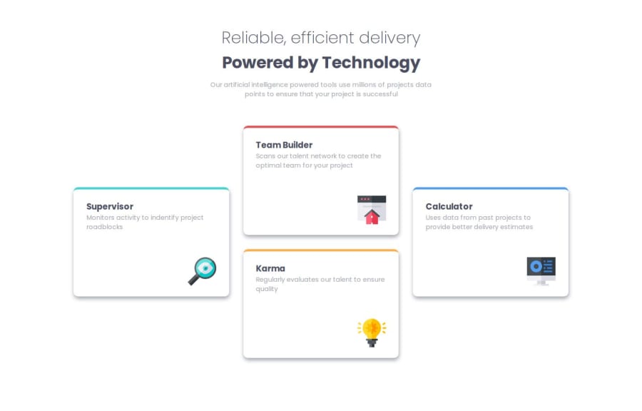
Four cards section using grid-template-areas
#pure-css
@Darionvr
Design comparison
SolutionDesign
Solution retrospective
What challenges did you encounter, and how did you overcome them?
I realized that the cards had different sizes in the desktop version and the mobile version. I would have liked to make them responsive for each version, but it was causing issues when creating the layout. So, I decided to keep them with a fixed size for convenience.
Community feedback
Please log in to post a comment
Log in with GitHubJoin our Discord community
Join thousands of Frontend Mentor community members taking the challenges, sharing resources, helping each other, and chatting about all things front-end!
Join our Discord
