Four Cards Layout Website Using Flexbox and Inline Align
Design comparison
Solution retrospective
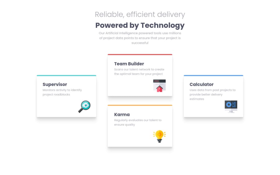
I made the pattern by aligning the left and the right cards vertically while grouping the middle two cards into a row-flexbox.
I wonder if there is a way of doing this without separating the cards into 3 sections. Either through only flexbox, or without it at all.
Also when I resize the width, the cards shrink. How would you make the cards the same size while shrinking the margins instead.
Community feedback
- @rfilenkoPosted about 4 years ago
Hey Resan, this layout can be easily done with css grid. I believe the issue with cards size - you are using vw and vh units (on tablet way to big, on small notebook size, ~ 1024 - too small). Setting max-width or max-height (or min) on cards itself may help to solve the issue.
Roman
3
Please log in to post a comment
Log in with GitHubJoin our Discord community
Join thousands of Frontend Mentor community members taking the challenges, sharing resources, helping each other, and chatting about all things front-end!
Join our Discord
