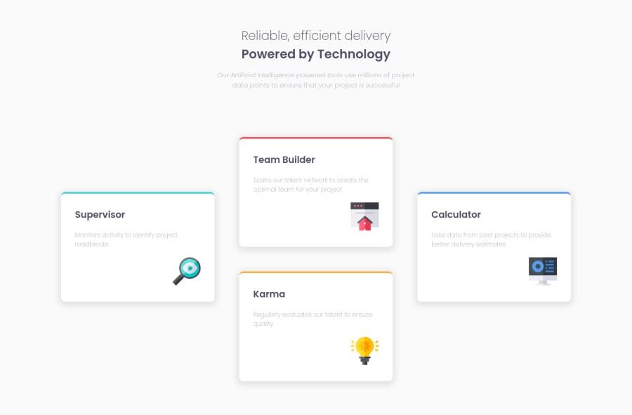
Design comparison
SolutionDesign
Solution retrospective
As always, If someone could give me some feedback to improve my skills, I would really appreciate it.
Community feedback
- P@jmnyaregaPosted almost 4 years ago
Hi @Nene16
Good job on the challenge, I have one recommendation:
- Try using grid-layout, it will reduce the amount of CSS code.
 .container {
       display: grid;
       grid-template-columns: repeat(3, 1fr);
       grid-template-areas: "a b c" "a d c";
 }

 .card1 {
      grid-area: a;
      align-self: center; // this will vertically align the first card, the same can be done on the last card.
 }
```1 - Try using grid-layout, it will reduce the amount of CSS code.
- @Sk7867Posted almost 4 years ago
Hi @Nene16👋 You did a great job with flex-box, It looks and works well. But as @Josiah Mokobo said using grid would save a lot of time and effort. I would suggest playing with css hover effects to make it more cool, Happy Codding😁
0
Please log in to post a comment
Log in with GitHubJoin our Discord community
Join thousands of Frontend Mentor community members taking the challenges, sharing resources, helping each other, and chatting about all things front-end!
Join our Discord
