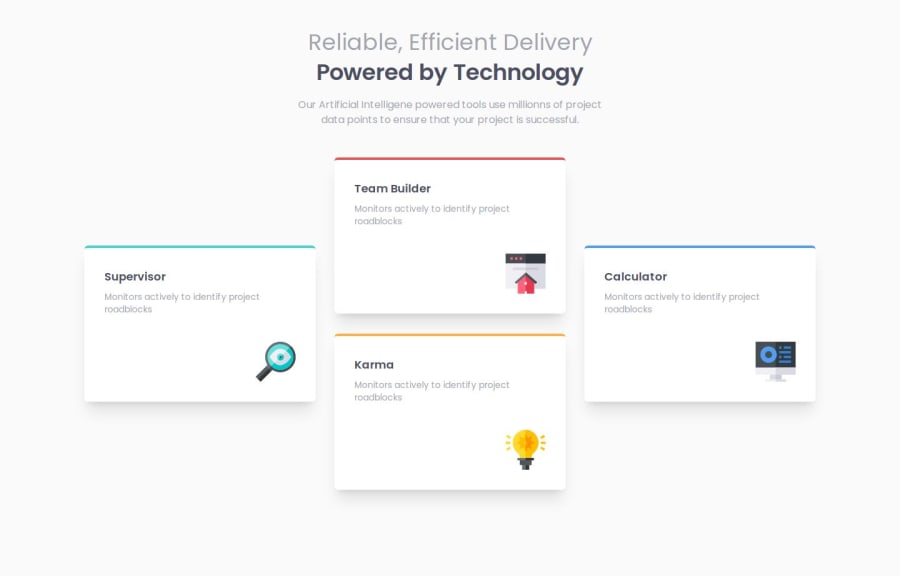
Design comparison
Solution retrospective
this challenge helped me to learn a about grids.
What challenges did you encounter, and how did you overcome them?this task is one of the most challenging for me, had to spend a lot of time to make the layout however still there are issues in solution. making the layout perfect for different screen sizes is the most challenging task.
What specific areas of your project would you like help with?The following are list of issues i could not solve: 1- the specific layout was most difficult to create. 2- my solution works perfectly for lg screens however on medium screens the cards overlaps and on small screen there is a issue of padding. 3- Still need much improvement , if anybody knows , how to make it perfectly please let me know.
Please log in to post a comment
Log in with GitHubCommunity feedback
- P@MikDra1
Nice one 😀
If you are curious how you can do this straight lines on the top of each card here is my tip:
Create another element in each of the cards. Then position this element absolute. Card should be positioned relative. At the end you need to give this element a height of 3px width of 100% and top 0 and left 0. You can also use ::after or ::before pseudo elements to create these.
Hope you found this comment helpful 💗
Good job and keep going 😁😊😉
- @cokecancook
Keep it simple! And watch out for the overlaying cards when sizing down the window ;)
Join our Discord community
Join thousands of Frontend Mentor community members taking the challenges, sharing resources, helping each other, and chatting about all things front-end!
Join our Discord
