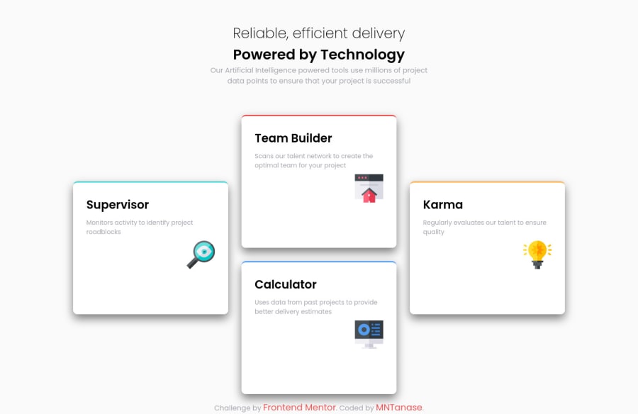
Design comparison
Solution retrospective
Not happy that I left that footer there but for now it's great. I'd like to receive feedback and also, masters, please tell me how can you fix that card border, I searched about it but without success in my abilities to understand.
For example, I was thinking to create another div, that would have a class "outer" or something and making them 5px height, color them and position them afterwards (position: absolute) and my boxes would have "position: relative" but, messed up and in final I gave up that it was more than I could chew.
I don't have buds that I can ask about web dev or people to talk to them, maybe in future... Anyway, please teach me senpai!
Community feedback
- @ApplePieGiraffePosted about 4 years ago
Hey, MariusT! 👋
Good job! Your page responds well! 👍
The borders on your cards look fine, too (I think I simply used
border-topas you did).Just a slight suggestion, but I think a subtler box-shadow on the cards would be a nice touch.
Keep coding (and happy coding, too)! 😁
0
Please log in to post a comment
Log in with GitHubJoin our Discord community
Join thousands of Frontend Mentor community members taking the challenges, sharing resources, helping each other, and chatting about all things front-end!
Join our Discord
