Design comparison
Solution retrospective
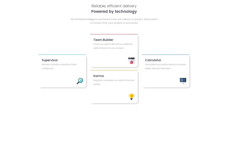
Hello, here's my solution for this challenge. Everything's fine i think however for the desktop size since i had to set 2 of the four cards on absolute position i had problems when resizing from mobile view to desktop. theses to absolutes cards would pass hover. i think the problem come from the width of my media queries or of the cards max-width. Anyway thanks for the design.
Community feedback
- @BlackpachamamePosted 11 months ago
Hey Johan! your work is very good. I think the ideal for this specific challenge was to work with
grid CSSor at least it is a good challenge to put it into practice.Everything looks correct, but I can tell you the following:
- If you would like to center the content in the center of the screen, instead of using
height: autoyou can usemin-height: 100vh - The cards on the sides overlap with those in the center at a certain screen width
- It is curious that you have not applied a
background-colorto your cards, even if they are the same color as thebodybecause you should define it in the same way - Here is my solution in case you want to take a look
0 - If you would like to center the content in the center of the screen, instead of using
Please log in to post a comment
Log in with GitHubJoin our Discord community
Join thousands of Frontend Mentor community members taking the challenges, sharing resources, helping each other, and chatting about all things front-end!
Join our Discord
