

Design comparison

Community feedback
- @YacoubDweikPosted 3 months ago
Hey! good job!
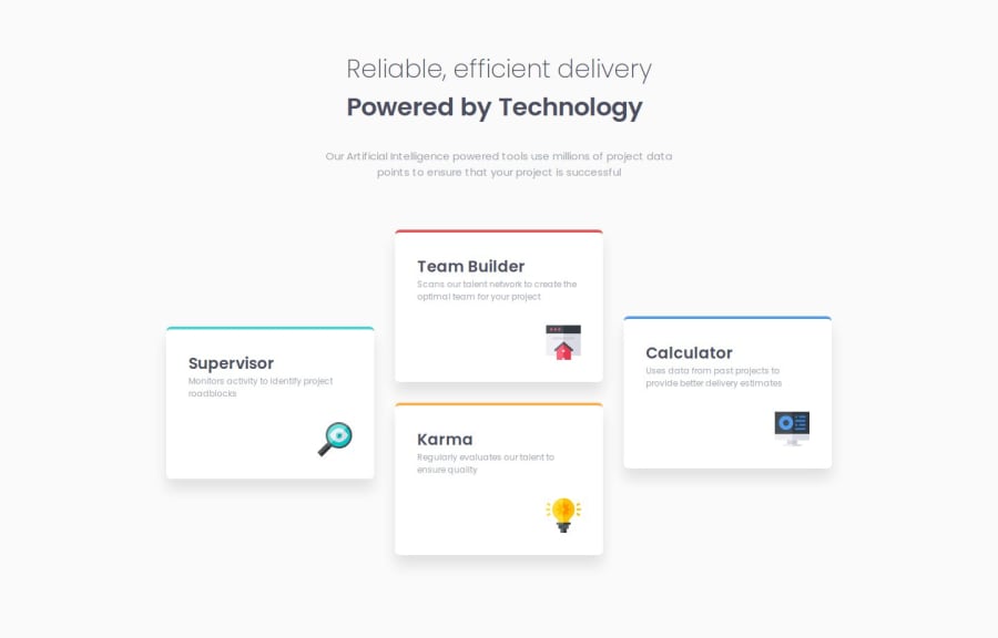
Your design overflows from 600px to almost 475px, and also overflows for almost all mobile screens.
it's ok as u r on your first steps to have these kind of stuff and we all have been thru such things.
when ur design overflows that means it's not gonna look nice on specific screens, like mobiles or tablets.
This happens in most cases bcuz u killed the responsivity of elements by giving them fixed widths, here for example the title takes a fixed width of 300px, 300px is gonna be always 300px.
Instead of that u can use width: 75%, and/or max-width some stuff like that.
also try to give fixed height for all cards to force them to stay in a nice pattern instead of having one is tall and another one is short.
Keep it up!
Marked as helpful0


Please log in to post a comment
Log in with GitHub
Join our Discord community
Join thousands of Frontend Mentor community members taking the challenges, sharing resources, helping each other, and chatting about all things front-end!
Join our Discord