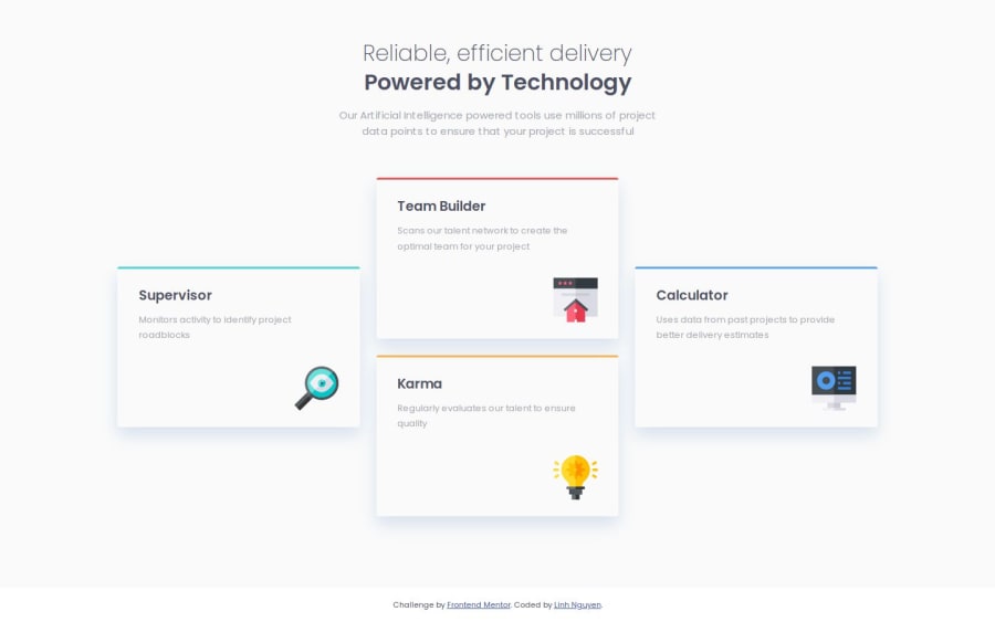


Design comparison
SolutionDesign

Solution retrospective
What are you most proud of, and what would you do differently next time?
Nothing much.
What challenges did you encounter, and how did you overcome them?While using Flexbox, I didn't know how to control the item width (set to 350px) until I found the Flexbox magic (flex: 1) which means flex-growth and flex-shrink equal 1, flex-basis equals 0. Due to that, the items now have the same width and responsive.
You can read more about Flexbox from Basic concepts of flexbox - MDN Web docs
What specific areas of your project would you like help with?- How to name tags and build structure in HTML.
- How to use grid in this project.
Community feedback
Please log in to post a comment
Log in with GitHub
Join our Discord community
Join thousands of Frontend Mentor community members taking the challenges, sharing resources, helping each other, and chatting about all things front-end!
Join our Discord