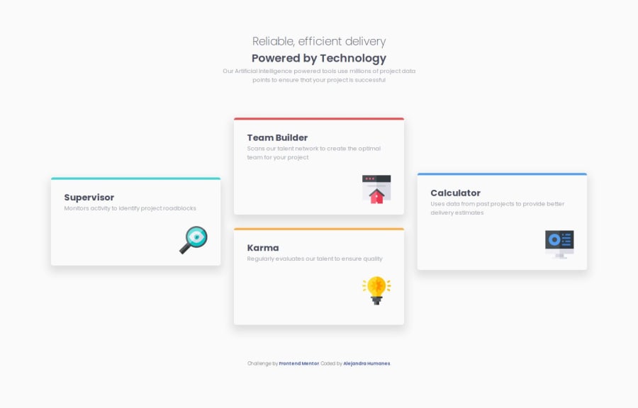
Design comparison
Community feedback
- @salva-itPosted 5 months ago
Congratulations on completing this challenge
Your code is well-written and clean, but a few small changes could enhance it.
** Using the
altattribute for images is very helpful for times when images do not load.** I suggest changing the card titles to use
<h3>so that the hierarchy of headings is properly maintained.** Using Google Fonts in the <head> section of HTML can be more beneficial for (Better Loading, Accessibility, Consistency, SEO Optimization)
** You can use the font-size tag with clamp() for responsive design
1
Please log in to post a comment
Log in with GitHubJoin our Discord community
Join thousands of Frontend Mentor community members taking the challenges, sharing resources, helping each other, and chatting about all things front-end!
Join our Discord
