

Design comparison

Solution retrospective
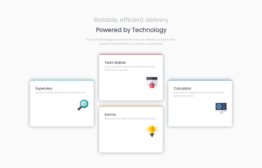
I'm proud of using grid to make the layout
What challenges did you encounter, and how did you overcome them?I encountered the challenge of styling space between paragraphs and component as their appear in the design. How to know the current space between paragraphs so i can know the amount to add up for example i could set margin of paragraphs to zero but still there was some space between them making it difficult to know the space to add so as they could look like in the design. I used developer tool.
What specific areas of your project would you like help with?I would like help on best ways how to style and calculate space between paragraphs. Is good to use margin, gap or other ways?
Community feedback
- P@MikDra1Posted 8 months ago
Nice one 😀
If you are curious how you can do this straight lines on the top of each card here is my tip:
Create another element in each of the cards. Then position this element absolute. Card should be positioned relative. At the end you need to give this element a height of 3px width of 100% and top 0 and left 0. You can also use ::after or ::before pseudo elements to create these.
Hope you found this comment helpful 💗
Good job and keep going 😁😊😉
1 - @raswondersPosted 8 months ago
Hi @Jackson-zablon15,
you've created nice solution. The way you handled the top stripes on those feature cards inspired me 🕵️♀️ and I reimplemented mine too .
Regarding the spacing inside feature cards I'd handle it slightly different. It's better when header of feature is sticking to the start of the flex container and icon to the the end of it. You already using flexbox so its as easy as removing those margins and setting
items-justify: betweenon your flex container.Regarding layout shift, i'd propose to use larger width when shift happens. Currently it shifts prematurely and horizontal scrollbars appear between 750px...1150px
Hope this note will help you in some way.
1


Please log in to post a comment
Log in with GitHubJoin our Discord community
Join thousands of Frontend Mentor community members taking the challenges, sharing resources, helping each other, and chatting about all things front-end!
Join our Discord