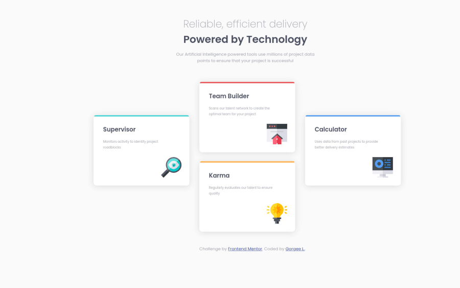
Design comparison
SolutionDesign
Solution retrospective
Hi everyone. I am new to this, please feel free to check my codes and comment suggestion to make my codes neat, correct, and short. Thank you.
Community feedback
- @SzymonRojekPosted almost 4 years ago
Hi Georgee,
Another project added, well done :D
@SaiArunesh already mentioned I would like to add a few tips from me below:
- try to do your project fully responsive for all devices;
- div class="one" is unnecessary => it will be better to put the top text inside of the header tag, then below the main tag just to indicate the main content (inside of it you can put these four divs);
- I'd recommend reading about headings. Just to let you know, you should only use one h1 per page. Using more than one will not result in an error, but using only one is seen as a best practice. => h1 is the most important heading, and tells you what the purpose of the overall page is (generally please read about headings h1-h6). In this project you can easily change the second h1 tag to the h2;
- alt text => don't need to use words like picture or image, photo, icons in the alt text as it's already announced as being an image. In this project, icons have only decorative role - that's a reason why alt text should be provided as a empty (alt="") so these icons can be ignored by assistive technologies, such as screen readers => in this project images have only a decorative role so alt should be empty;
- names of the classes should be readable and descriptive => maybe start to learn the BEM naming convention;
- reset the styles in a seperate selector * { margin: 0; padding: 0, box-seizing: border-box; } => also when margin has got 0 then you don't have to add px;
- important: width and height => you gave explicit width and height, that's not a good practice especially that you want to use the flexbox or grid. It is essential to understand well the height and width vs min-height/max-height & min-width/max-width. You shouldn’t need to give items height unless they have a background or absolutely-positioned or floated elements within them that would not normally be accounted for in the height of an element. Experienced developers use min-height and min/max-width more than anything else. It allows elements to grow and shrink;
Ps. Don't forget to upvote any comments on here that you find helpful.
Greetings :D
3@iamgorgeePosted almost 4 years ago@SzymonRojek Hi. Thank you for your suggestions. I will surely look into that.
0
Please log in to post a comment
Log in with GitHubJoin our Discord community
Join thousands of Frontend Mentor community members taking the challenges, sharing resources, helping each other, and chatting about all things front-end!
Join our Discord