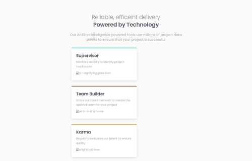
Design comparison
Solution retrospective
I'm glad that I came back to this after taking some time away. Still, I am having trouble with the code.
What challenges did you encounter, and how did you overcome them?I had limited experience with the different display functions in CSS, so I learned a lot more about them and practiced with some online courses/ games. Unfortunately, I'm still having issues with the display.
What specific areas of your project would you like help with?I would really appreciate if anyone can help with why my @media command isn't changing the layout the way I've intended it to. I've spent a lot of time looking at it and trying different tweaks to no avail.
Community feedback
- @KapteynUniversePosted 18 days ago
There are always other ways to do it like mentioned below but to answer your question:
First problem is you didn't use
display: grid;
on .card-gridSecond problem is i think grid-template-area only accepts string values.
Try this;
@media (min-width: 769px) { .card-grid { display: grid; grid-template-columns: repeat(3, 33.3%); grid-template-rows: repeat(2, 50%); grid-template-areas: "three four six" "three five six"; } }
@media (min-width: 769px) { #supervisor { grid-area: three; align-self: center; } }
@media (min-width: 769px) { #team-builder { grid-area: four; } }
@media (min-width: 769px) { #karma { grid-area: five; } }
@media (min-width: 769px) { #calculator { grid-area: six; align-self: center; } }
And add a margin to overview so it will center.
@media (min-width: 769px) { .overview { max-width: 40rem; margin: 0 auto; grid-area: 2; } }
Also you forgot to upload the assets to Github.
Marked as helpful0 - @frost3dWavePosted 18 days ago
Try aligning with grid-column & grid-row properties on your instead of grid-area. It should work.
- First of all, create a 12 column grid layout with row that you prefer (6/8 whatever you feel comfortable with).
- make sure to use
1fr
when defining your columns & rows instead of percentage based that you have now. - align individual cards with grid-column-start/grid-column-end & grid-row-start/grid-row-end. It should work.
Marked as helpful0 - @Lukas3162000Posted 18 days ago
You can make your .card-Grid class a flex-container for your cards with display:flex;
after that use flex-direction: row; to make the cards go in line as intended.
in your @media-command you can change the flex direction of your .card-Grid class to column to get them to change direction as in the images provided.
also in your html u might wanna checkout your teambuilder class/div bcs i think the div isn't working as you intended it to, but im not sure with that one tbh.
over all i think you did a great job coming back to developing and just need to tweek some things here and there and most importantly don't lose fun and stay consistent with it.
keep it up, hope that helps :D
Marked as helpful0
Please log in to post a comment
Log in with GitHubJoin our Discord community
Join thousands of Frontend Mentor community members taking the challenges, sharing resources, helping each other, and chatting about all things front-end!
Join our Discord