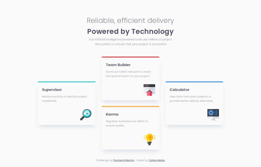
Design comparison
Solution retrospective
I've successfully created the website with Sass and I'm becoming more comfortable with it. I tried out Mixins for the first time, and although there's still a lot to learn, I was able to pull it off.
What challenges did you encounter, and how did you overcome them?I'm still learning Sass and becoming accustomed to structuring code across various files for improved organization and to avoid code repetition. I've been searching for guidelines and videos on the most common patterns and methods for structuring files within a repository.
What specific areas of your project would you like help with?This time, I don't believe there are any specific issues, but please feel free to give me feedback on anything that could be improved or fixed. Thank you in advance!
Please log in to post a comment
Log in with GitHubCommunity feedback
- @1lija
All that I could think to say "negative" is you didn't really need to add a wrap div around everything else. Since all that's supposed to be shown for this exercise is what you've created, you could've just used whole of body for the wrap itself. Adding to that is since all that was supposed to be created was this, you didn't really need to add class to p and h2 on the cards themselves. That's my opinion of course, but other than that, everything is in place. Great work!
Marked as helpful
Join our Discord community
Join thousands of Frontend Mentor community members taking the challenges, sharing resources, helping each other, and chatting about all things front-end!
Join our Discord
