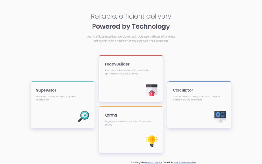
Four Card Section with HTML5 & CSS3 Grid, Flex & Media Query


Design comparison

Community feedback
- @VenusYPosted 9 months ago
Great work on this challenge! You've done well making the site look like the design.
There are a few things I'd like to point out though.
It's not recommended to use
<br>tags for layout purposes, which you've done after the header element from what I can tell.<br>tags are generally used to separate lines of text.Instead, you could add a
margin-bottomto the header element to achieve the same effect.I noticed that you applied
height: 100vhto the body element, which causes some issues with overflow where the content gets cut off if the height of the viewport is not tall enough to fit all the content at once.You can fix this by simply using
min-heightinstead:body { min-height: 100vh; }I saw that you actually tried to combat this issue in the mobile version by adding
margin-top: 400pxto the body element.The solution I provided above fixes this issue, so you can safely remove
margin-top: 400pxfrom the body without affecting the layout.It's also not ideal to use
<figure>as a wrapper element for the cards as this tag has semantic implications.In most cases, it's used to encapsulate an
<img>and a corresponding<figcaption>to associate them with each other.If you wanted a generic wrapper element, a div would have worked well in that situation:
<div class="cards">
  ...
</div>
To improve the visual balance, readability, and thus user experience of your site, you could add whitespace around the content by applying a padding or margin to the body element:
body {
  padding: 50px
}
I've chosen 50px as an example, but if you plan to implement this, you can adjust the value to your liking.
Another thing is the positioning of the
.attributionelement. On certain viewports, it overlaps with the main content of the page, which can hinder the readability of your site.This is because the
.attributionelement has no positioned ancestors, which means that its containing block defaults to the viewport.Some viewports are not big enough to fit all the content while leaving enough whitespace at the bottom, which results in overlapping.
To fix this, you can remove the
positionandbottomproperties from the.attributionelement, and apply these styles insteadbody { position: relative; } footer { position: absolute; bottom: 0; }The footer is positioned absolutely relative to the body as it's now the closest positioned ancestor due to the
position: relativeproperty.The line of text will already be centered due to the flex properties you've applied to the body. Finally,
bottom: 0positions the attribution at the bottom of the body element.To improve the responsiveness of your site, I would recommend against using hard-coded widths for your grid columns.
While the rem values you've used allow the cards to scale with changes in font size by the user, at smaller viewport widths, I found that the content was partially cut off horizontally, resulting in the far left card not being readable.
When you shrink the viewport width past a certain point on the mobile version, the
.card__imgelement moves outside of the card.This is happening because you're positioning the image like this:
.card__img {
  position: relative;
  top: 54px;
  left: 225px;
}
This doesn't account for situations where the width of the card becomes narrower than 225px.
To fix this, you could turn the
.cards__cardelement into a flexbox like so:.cards__card { display: flex; flex-direction: column; align-items: start; } .card__img { margin-top: auto; margin-left: auto; }margin-top: autoandmargin-left: autopush the image as far down and far right, respectively, as possible.I noticed that you are adding whitespace between the description and title in the cards using
position: relative:.card__text { position: relative; top: 10px; }An easier method would be to add
margin-bottomto the.card__titleelement instead:.card__title { margin-bottom: 0.625rem; }I know this was incredibly long, so my apologies for that, but I hope it's been helpful to you in some way. If there are any issues with the solutions that I've provided, please feel free to let me know or ask questions. :)
Marked as helpful0 - @crimson3dPosted 9 months ago
Thank you very much for your feedback!!! Your comments have been very helpful for some of the problems I encountered when making this design, thanks again ❤️
1

Please log in to post a comment
Log in with GitHub
Join our Discord community
Join thousands of Frontend Mentor community members taking the challenges, sharing resources, helping each other, and chatting about all things front-end!
Join our Discord