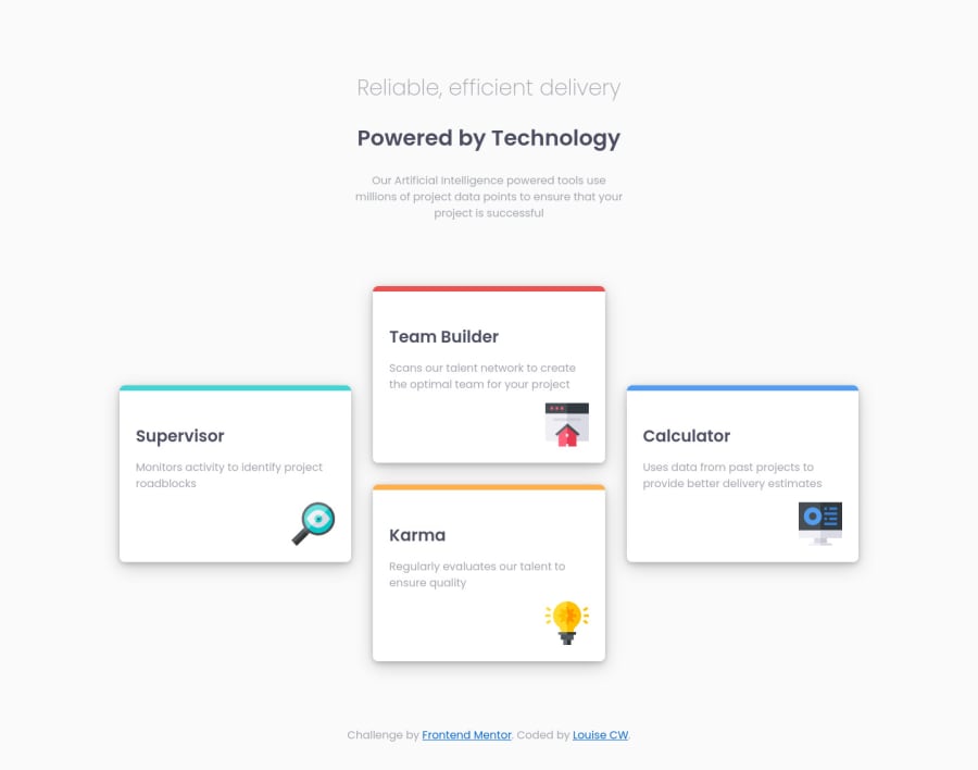
Design comparison
Solution retrospective
Hi everyone, any comments much appreciated.
Specific questions:
What other methods are there for the larger size layout, apart from grid-template-areas?
What's the best way to approach mid-size devices such as tablets?
Community feedback
- @markup-mitchellPosted about 3 years ago
@costelloeward, I haven't done this challenge, but from the looks of it you could use nested flexbox elements for the desktop layout. Three columns with 1,2,1 card in them respectively. That could collapse quite nicely onto the mobile layout, too, I imagine.
Unless you're given tablet-specific designs you just need to use your discretion about the implementation. Assuming a mobile-first approach, the default behaviour is going to be that it'll look like mobile until it hits the desktop breakpoint.
Hopefully you've implemented the mobile components in a way that it scales up gracefully and will be "good enough", but sometimes the content just doesn't lend itself to that.
How much effort you put into reconciling the design to tablet sizes is up to you in your work context (watch out - it can be a real rabbit hole!). I'd suggest that the simplest responsible thing to do is find the widest viewport where things still look acceptable and constrain the design there using
max-widthuntil the desktop media queries kick in.Marked as helpful0
Please log in to post a comment
Log in with GitHubJoin our Discord community
Join thousands of Frontend Mentor community members taking the challenges, sharing resources, helping each other, and chatting about all things front-end!
Join our Discord
