Design comparison
Solution retrospective
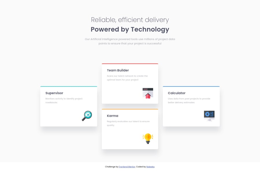
𝗛𝗲𝗹𝗹𝗼 👋😄 , 𝗧𝗵𝗶𝘀 𝗶𝘀 𝗺𝘆 𝘀𝗼𝗹𝘂𝘁𝗶𝗼𝗻 𝗳𝗼𝗿 𝗳𝗼𝘂𝗿 𝗰𝗮𝗿𝗱 𝗳𝗲𝗮𝘁𝘂𝗿𝗲 𝘀𝗲𝗰𝘁𝗶𝗼𝗻
Leave your thoughts below
Community feedback
- @DavidMorgadePosted about 2 years ago
Hello Naleeka congrats on finishing the challenge! pretty crazy result with the hover effect and the extra page you added!!
Nothing to say about your CSS, you nailed it and the mobile version of it also looks great!, you could also add some transitions to your 'see more' buttons for example:
transition: all 0.5s ease;should do a pretty good job.I would also recommend you to try using more semantically meaning html tags, dividing the
mainin twosectionsand going for anarticleon each card would fit perfect.Apart from that really nice job, gonna take your project as an inspiration for my next work (when I finish my current challenge)!
Hope my feedback helped you!
Marked as helpful1@NaleekaPosted about 2 years ago@DavidMorgade Yeah I think I must study more about html tags and how should I use them properly. Thank you so much for offering your valuable advice ❤
1
Please log in to post a comment
Log in with GitHubJoin our Discord community
Join thousands of Frontend Mentor community members taking the challenges, sharing resources, helping each other, and chatting about all things front-end!
Join our Discord
