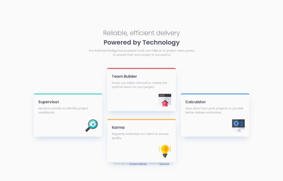
Design comparison
SolutionDesign
Solution retrospective
What challenges did you encounter, and how did you overcome them?
I didn't encounter any major problems but i had a little bit of problem adjust the box-shadow.By trial and error i adjusted it.
What specific areas of your project would you like help with?Full code on review.Let me know what can be cleaned up, better organized, and just all around any detailed suggestions you can possibly leave me with to help make me a better programmer. Thank you for your feedback.
Community feedback
Please log in to post a comment
Log in with GitHubJoin our Discord community
Join thousands of Frontend Mentor community members taking the challenges, sharing resources, helping each other, and chatting about all things front-end!
Join our Discord
