Design comparison
Solution retrospective
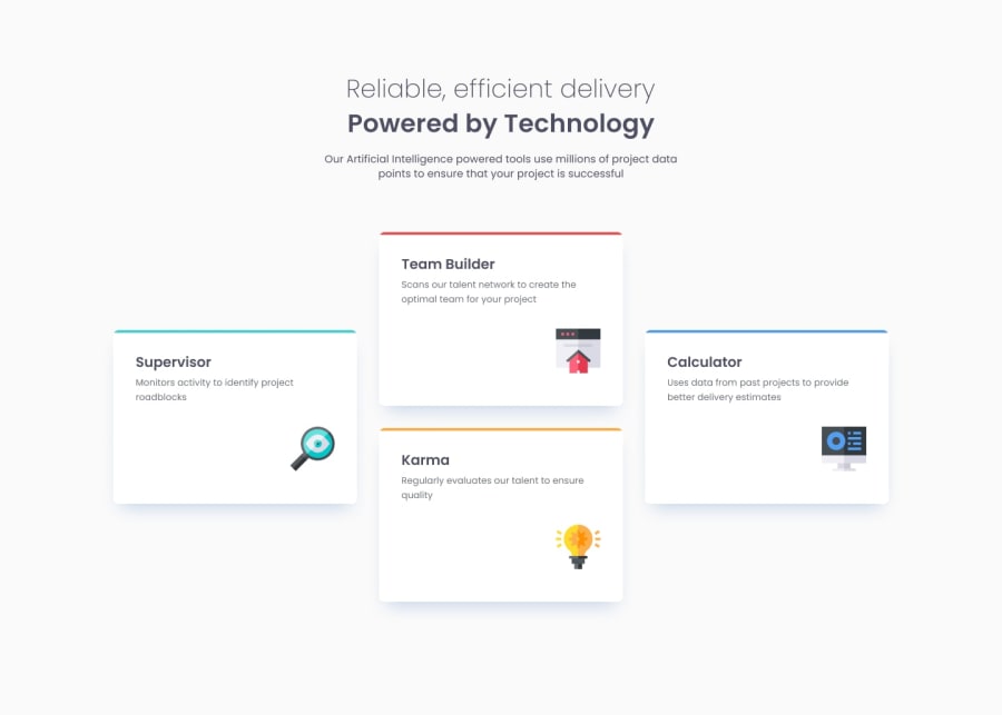
I'm most proud of successfully integrating the visual design elements into the project, particularly the decorative line and the way it interacts with the container's borders. The effect of creating a quarter-circle at the edges added a unique touch to the design, making the layout more visually appealing and professional.
Next time, I would start by sketching the design layout and structure on paper or a digital tool before jumping into the code. This could help in visualizing the alignment and spacing more clearly, potentially saving time on adjustments later. Additionally, I would explore more advanced CSS techniques or possibly use SVGs for even greater precision and flexibility in the design.
What challenges did you encounter, and how did you overcome them?One of the significant challenges was ensuring that the decorative line and mainly the CSS Grid were integrated seamlessly with the containers designed in Figma, particularly in making the edges appear as quarter-circles and the containers to get a bad position in the grid. It was tricky to align the line correctly without it either overflowing awkwardly or being misaligned with the container's borders.
I overcame this by experimenting with border-radius and carefully adjusting the line’s positioning using negative margins and overflow properties. Iterating on the design and testing various configurations helped me find the right balance between aesthetics and functionality.
What specific areas of your project would you like help with?I would appreciate feedback on a few areas:
I'm curious to know if there are more efficient ways to make this design fully responsive across different screen sizes, particularly mobile devices.
Any tips on improving the accessibility of this layout? I'd like to ensure that the visual elements don't hinder screen readers or create issues for users with visual impairments.
Community feedback
- @BlanchevalenPosted 8 months ago
Dear Jpcardozx!
Your HTML and CSS code is tidy. There are some trick that can help make your code shorter and more maintaible. If you apply CSS reset, you can save many "margin:0" line. There is a good article: https://www.joshwcomeau.com/css/custom-css-reset/. Maybe the root variables also can you help, https://www.shecodes.io/athena/34209-how-to-create-root-variables-for-colors-in-css. Finally the relative measures can help you make more responsive design. Kevin Powel's Youtube channel contain many videos in this topic.
Happy coding!
Marked as helpful1 - P@MikDra1Posted 8 months ago
Nice one 😀
If you are curious how you can do this straight lines on the top of each card here is my tip:
Create another element in each of the cards. Then position this element absolute. Card should be positioned relative. At the end you need to give this element a height of 3px width of 100% and top 0 and left 0
If this comment was useful please mark it as helpful 💗
Good job and keep going 😁😊😉
Marked as helpful1 - @0xbluPosted 8 months ago
great work! icon images for cards are not displaying correctly, remember to use relative paths or your app won't work on production environments :)
0
Please log in to post a comment
Log in with GitHubJoin our Discord community
Join thousands of Frontend Mentor community members taking the challenges, sharing resources, helping each other, and chatting about all things front-end!
Join our Discord
