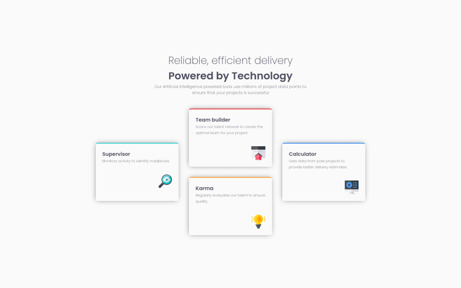
Design comparison
Solution retrospective
I am welcome to any advices and tips to improve my code!
Community feedback
- Account deleted
Hey there! 👋 Here are some suggestions to help improve your code:
-
Move the
headeroutside of the `main element. -
Implement a Mobile First approach 📱 > 🖥
-
Using CSS Grid with Grid-Template-Areas will make things way easier when building the layout; it will give you full control of the layout.
Here is an example of how it works: EXAMPLE
With mobile devices being the predominant way that people view websites/content. It is more crucial than ever to ensure that your website/content looks presentable on all mobile devices. To achieve this, you start building your website/content for smaller screen first and then adjust your content for larger screens.
If you have any questions or need further clarification, feel free to reach out to me.
Happy Coding! 🍂🦃
Marked as helpful0 -
Please log in to post a comment
Log in with GitHubJoin our Discord community
Join thousands of Frontend Mentor community members taking the challenges, sharing resources, helping each other, and chatting about all things front-end!
Join our Discord
