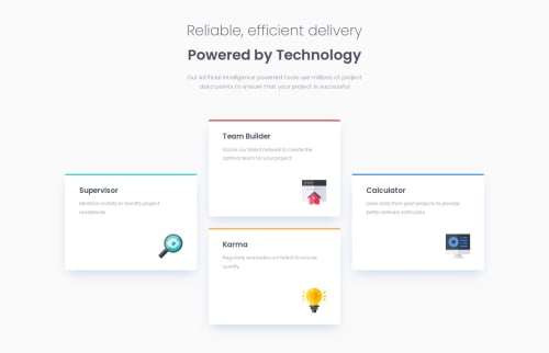
Submitted over 1 year agoA solution to the Four card feature section challenge
Four card section
@Arnotts33

Solution retrospective
What are you most proud of, and what would you do differently next time?
Nothing to mention here. Workflow is getting fluid.
What challenges did you encounter, and how did you overcome them?I had a few challenges:
-
Colored borders, I can not get them exactly as the design.
-
The responsive layout: I think it looks okay but I would like to find how to make the responsiveness more fluid without having to tweak or hard code everything.
My CSS file is quite long... I will try to find where I can be more efficient.
Any suggestions welcome :)
Code
Loading...
Please log in to post a comment
Log in with GitHubCommunity feedback
No feedback yet. Be the first to give feedback on Arnaud Lahaut's solution.
Join our Discord community
Join thousands of Frontend Mentor community members taking the challenges, sharing resources, helping each other, and chatting about all things front-end!
Join our Discord