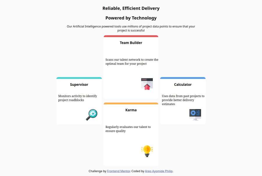
Design comparison
Solution retrospective
Being able to think outside of what i was taught.
What challenges did you encounter, and how did you overcome them?How to make the second and last card in the same container, i overcome it by justing putting them in the same div
What specific areas of your project would you like help with?@media query
Community feedback
- P@josifermaodevPosted 5 months ago
Your code, from what I can see, is a bit disorganized in the HTML section, lacking indentation.
Indentation is a concept used in programming to organize and structure source code in a clear and readable way. It consists of adding spaces or tabs at the beginning of each line of code, in order to create a visual hierarchy that makes the program easier to understand.
using your code as an example, instead of doing it like this:
<div class="card-container">
  <div class="card green">
    <h3>Supervisor</h3>
  <p>  Monitors activity to identify project roadblocks</p>
  <img src="./images/icon-supervisor.svg" alt="Supervisor">
  </div>
the correct one would be:
<div class="card-container card-green"> <h3>Supervisor</h3> <p>Monitors activity to identify project roadblocks</p> <img src="./images/icon-supervisor.svg" alt="Supervisor"> </div>➡️And explaining your doubt: A media query checks the specified condition and applies the styles defined within it only if the condition is true.
Examples:
- Adjust style for screens smaller than 599px:
@media (max-width: 599px) {
  body {
    background-color: lightblue;
  }
}
In this example, the body background will change to lightblue on screens with a width of 600px or less.
- Adjust style for screens larger than 600px:
@media (min-width: 600px) {
  body {
    background-color: lightblue;
  }
}
In this example, the body background will change to lightgreen on screens with a width of 600px or more.
- Adjust the style for screens between 600px and 1440px wide:
@media (min-width: 600px) and (max-width: 1440px) {
  body {
    background-color: lightblue;
  }
}
In this example, the body background will change to lightblue on screens with width between 600px and 1440px.
Good job!
0
Please log in to post a comment
Log in with GitHubJoin our Discord community
Join thousands of Frontend Mentor community members taking the challenges, sharing resources, helping each other, and chatting about all things front-end!
Join our Discord
