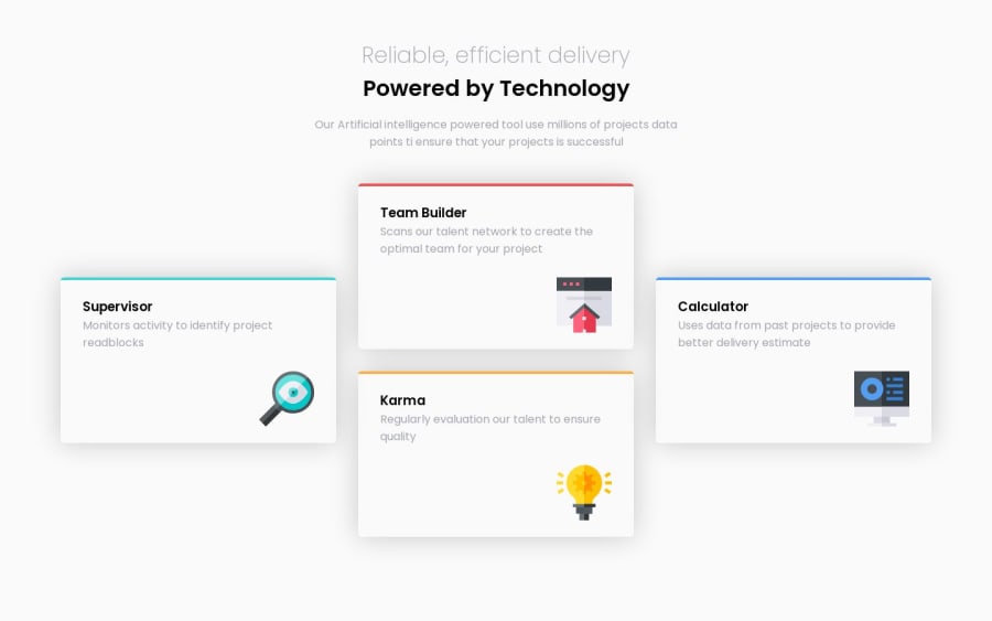
Design comparison
Solution retrospective
I had already forgot that I needed to do this project although I had already downloaded it, thanks frontendmentor for this awesome projects you are providing to us
Am open for any comments
Community feedback
- @Sachin-MahatoPosted over 1 year ago
Good job for completing the challenge
.Do not forget ⚠️ to check your FEM report (It provides value information), to see what is incorrect and update your code with it. This should be done immediately after submitting your challenge.
.Avoid skipping heading levels ⚠️. Always start with the h1 (which can only be used once) and you will go down the hierarchy level depending on the heading’s level of importance.
Usage of absolute units instead of relative units:
- Absolute units like pixels (
px) are used for defining lengths and sizes instead of relative units like percentages (%),em, orrem. - Relative units are more flexible and responsive across different screen sizes.
Your CSS Reset is being underutilized. 😢 To fully maximize 💯 it, you will want to add more to it. Here are some examples that you can freely use 😁: Josh Comeau Reset Eric Meyer Reset
For improved accessibility 📈 for your content, it is best practice to use em ✅ for media queries. Using this unit gives users the ability to scale elements up and down, relative to a set value use this link to learn about media queries
I hope you find this helpful and happy coding
Marked as helpful0 - Absolute units like pixels (
Please log in to post a comment
Log in with GitHubJoin our Discord community
Join thousands of Frontend Mentor community members taking the challenges, sharing resources, helping each other, and chatting about all things front-end!
Join our Discord
