

Design comparison

Solution retrospective
That I am definitely feeling improvement with each project, not exactly that understanding better just that employing the tools faster and using wider variety of the tools.
That said I have not had a single project that the screenshot did not show notably different size and got no clue what doing wrong there with it looking perfect in chrome dev tools full range of screen sizes. I am expecting this one to be the same.
Also bit hit or miss getting font exactly the right one, weight, and size when doing it purely by eye.
Community feedback
- @AdrianoEscarabotePosted 4 months ago
Hi Crystalis89, how are you doing? I really loved the outcome of your project, but I have a few suggestions that I think might be helpful:
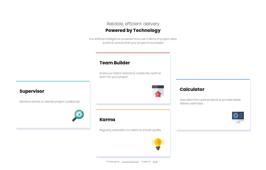
<h1>Reliable, efficient delivery</h1>
<h1>Powered by Technology</h1>
The most appropriate in this case would be just an h1 tag! containing the two contents, to make them break a line, we can use a max-width, and for the styling we can use a span element with the content that will be changed!
The main tag must be present in every HTML document so that we can recognize the main content. To fix this, wrap the main content in the main tag. Users of assistive technology will have a better navigation experience on your site thanks to the use of HTML5 landmark elements.
The rest is excellent.
I hope you find it useful. 👍
0


Please log in to post a comment
Log in with GitHubJoin our Discord community
Join thousands of Frontend Mentor community members taking the challenges, sharing resources, helping each other, and chatting about all things front-end!
Join our Discord