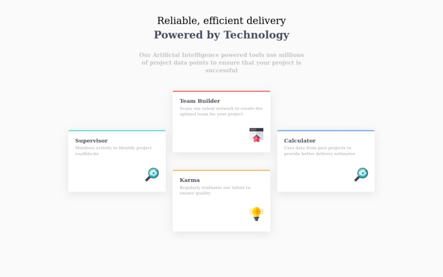
Design comparison
SolutionDesign
Solution retrospective
I appreciate it so much any feedback
Community feedback
- @samsonshamPosted over 2 years ago
Hello Facundo 👋 Congratulations for completing this challenge 🎉 I see you make good use of grid box and calculate the row and column nicely👍
Some of my suggestions below:
- I see you have imported the font family Poppins but I couldn't see you are using it.
font-family: 'Poppins', sans-serif;So you might not be intentionally not using the given font, right? - I see you put the first part of heading into
<span>. It should be part of the heading so is semantically better to put it intoh1as well and add necessary<strong>and line break. And<span>is an inline element so be careful your using might cause some unwanted inline effect. - Incorrect icon in Calculator card.
Hope this helps! Have a nice day!
Marked as helpful0@Facu3071Posted over 2 years ago@samsonsham Thanks you so much for you help. Good vibes Samson!
1 - I see you have imported the font family Poppins but I couldn't see you are using it.
Please log in to post a comment
Log in with GitHubJoin our Discord community
Join thousands of Frontend Mentor community members taking the challenges, sharing resources, helping each other, and chatting about all things front-end!
Join our Discord

