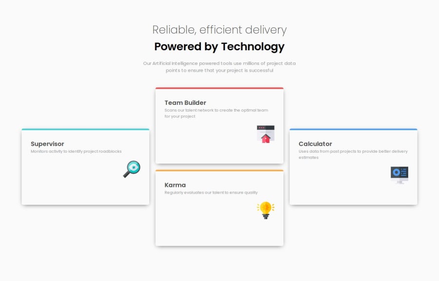
four card project using SCSS
Design comparison
Solution retrospective
I’m particularly proud of how I utilized SCSS mixins to create reusable styles, such as flex layouts and centralizing the border color styles for each card. This approach significantly improved in reducing generated CSS code , allowing me to make layout changes efficiently across the project.
What challenges did you encounter, and how did you overcome them?I struggled with aligning elements in the desktop layout, especially when positioning elements like .super_container and .calc_container to stick to the left and right edges while keeping the middle elements centered. This alignment was difficult to achieve within a single flex container due to the varying content sizes, which made the elements misalign or fail to stretch evenly. To address this, I added wrappers (wrapper_super, merge_box, and wrapper_calc) around certain elements to create individual flex containers. This allowed me to control the alignment and distribution of each section separately. By combining justify-content: space-between with media queries, I was able to create a responsive desktop layout that aligned as desired.
What specific areas of your project would you like help with?While the current layout works, I feel there may be more efficient flexbox techniques or grid approaches to achieve the desired desktop layout without as many nested wrappers. Any guidance on optimizing complex responsive layouts with fewer containers would be helpful. I’d appreciate tips on maintaining equal height for flex children in a row without relying on fixed height or min-height. Sometimes, flex children with varying content height still misalign slightly on different screens, and I’m looking for more flexible ways to solve this.
Community feedback
- @Bruno514Posted 6 months ago
Very nice layout! I actually used grid and didn't even think this challenge was possible using only flexbox...
1P@VSKarthikTPosted 6 months ago@Bruno514 As a new learner, I initially thought achieving this layout with flexbox might not be possible, but I found that wrapping the middle divs made it work perfectly!
1
Please log in to post a comment
Log in with GitHubJoin our Discord community
Join thousands of Frontend Mentor community members taking the challenges, sharing resources, helping each other, and chatting about all things front-end!
Join our Discord
