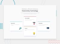
Design comparison
Solution retrospective
Hi, i completed this challenge, any feedback is welcomed! :)
Community feedback
- @correlucasPosted over 2 years ago
👾 Hello Daniel, congratulations for your solution!
Everything seems fine and responsive, mobile and desktop working okay!
I've some tips for you:
1.The colored bar on top of each card should be flat not rounded, to achieve this effect maybe is better you use a
<span>and add the color and aheight: 8px;to have the colored bar without the influence of the border-radius from the card.2.The box-shadow is too strong and flat, try to work the blur and opacity values for a smooth
box-shadow. Use this tool for better shadows, create the shadow and just drop the code inside the css:https://html-css-js.com/css/generator/box-shadow/
3.You can create an custom
tablet media querywith the 2 cards in which rows, just an idea.The rest is alright. Congrats. Happy coding!
1
Please log in to post a comment
Log in with GitHubJoin our Discord community
Join thousands of Frontend Mentor community members taking the challenges, sharing resources, helping each other, and chatting about all things front-end!
Join our Discord

