Design comparison
SolutionDesign
Community feedback
- @adrian-reina-391Posted 8 months ago
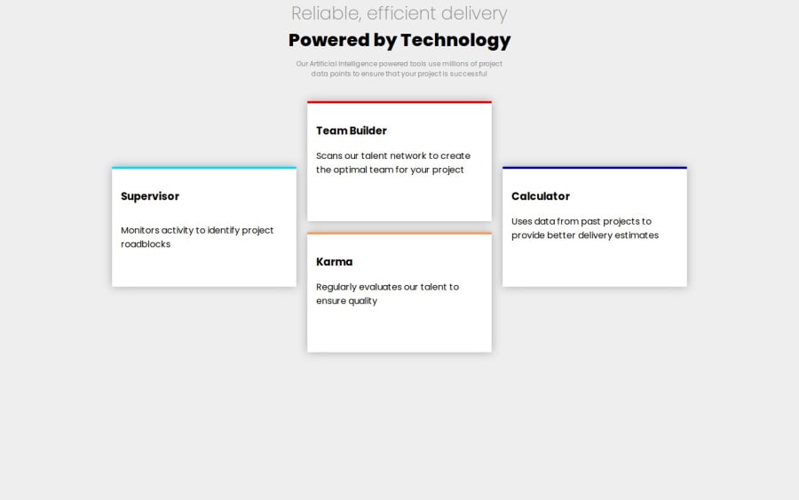
hello, you should add border-radius to the cards, and also reduce font-weight in the titles, the mobile view should break at 768px width
0
Please log in to post a comment
Log in with GitHubJoin our Discord community
Join thousands of Frontend Mentor community members taking the challenges, sharing resources, helping each other, and chatting about all things front-end!
Join our Discord
