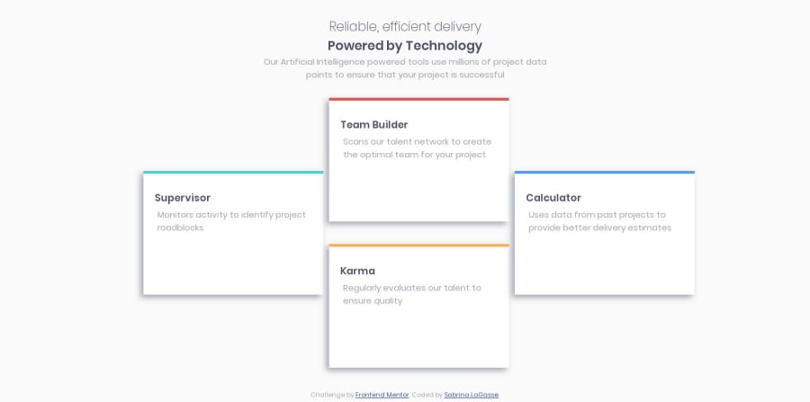
Four card page using flex + grid, with responsive typography


Design comparison

Solution retrospective
Not quuuuite the same as the design, but it is an attempt! Tried to use em's instead of pixels. Any and all constructive feedback appreciated. :)
Community feedback
- @mattstuddertPosted over 4 years ago
Great work on this challenge, Sabrina, and congrats on submitting your first solution! Accuracy to the design will come with time and practice, so don't worry. Your overall layout looks really good, it's just some of the spacings, etc that would need to be tweaked.
I typically use
remunits instead ofemas they're more predictable because they only look at thefont-sizeof thehtmlelement. Whereasemcan get a little tricky as it is sized based on the closest ancestor withfont-sizedeclared. Different developers will take different approaches though, so ifemworks for you then that's great.Also, quick heads up that your GitHub repo link is broken. You can update it by clicking the 3 vertical dots at the top right of this page and updating the URL. That will make it easier for others to see your code.
I hope you enjoyed the challenge. Keep up the great work!
0

Please log in to post a comment
Log in with GitHub
Join our Discord community
Join thousands of Frontend Mentor community members taking the challenges, sharing resources, helping each other, and chatting about all things front-end!
Join our Discord